OnTask
Helped students stay productive while working from home by optimizing their schedule and motivating them with rewards.
Discovery
Interview insights
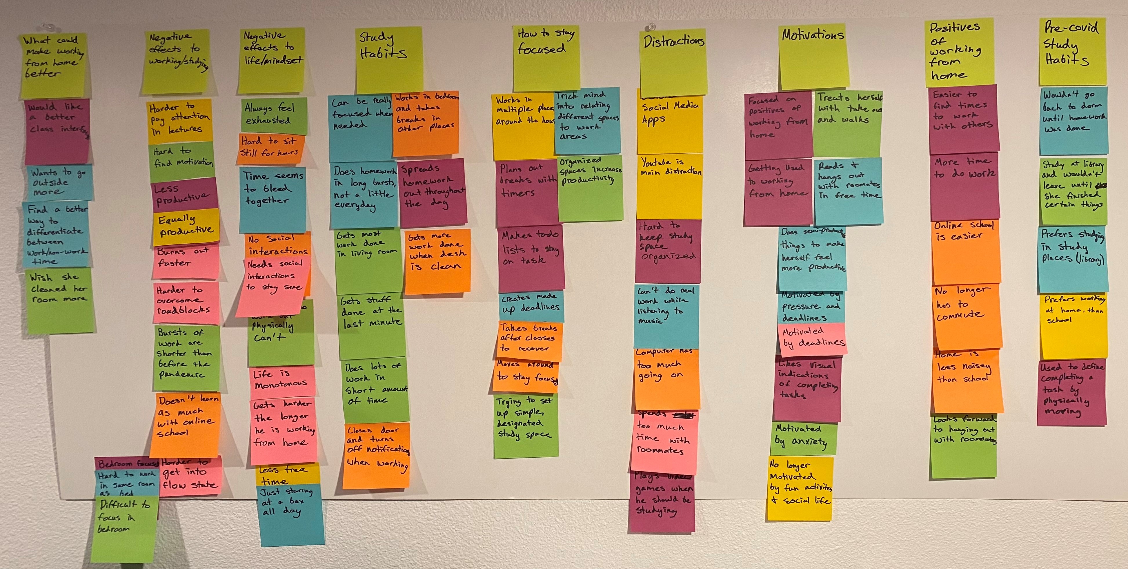
After interviewing six college students I was able to better understand the problems they had while working from home, the variety of study habits they used, and the unique things they did to stay on task. All my participants agreed that working from home was much more boring and monotonous. They also got distracted by their devices more frequently, which made it harder for them to stay focused on their tasks. Some of them had different study tricks for motivating themselves to complete a task. Also, they all agreed that being organized led to increased productivity. Therefore, I needed to design an app that organized student's schedules, eliminated distractions, and motivated them to do their work.
Building a user flow
I determined my initial user flow from my user interviews and the WAAD board I created from them. This helped me categorize my research into the main sections I need for the app. Then, I determined my initial golden path which consisted of creating a schedule around the user's study habits, keeping track of their to-do items, and a study mode to block notifications on the phone. Next, I made a list of extra features that could make the app better like adding rewards for completing tasks, or linking your schedule with your friends so you can study together. Lastly, I condensed the features down by importance and feasibility, which gave me the final user flow.
MVP
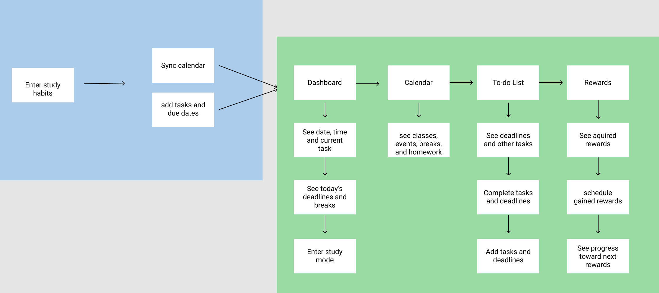
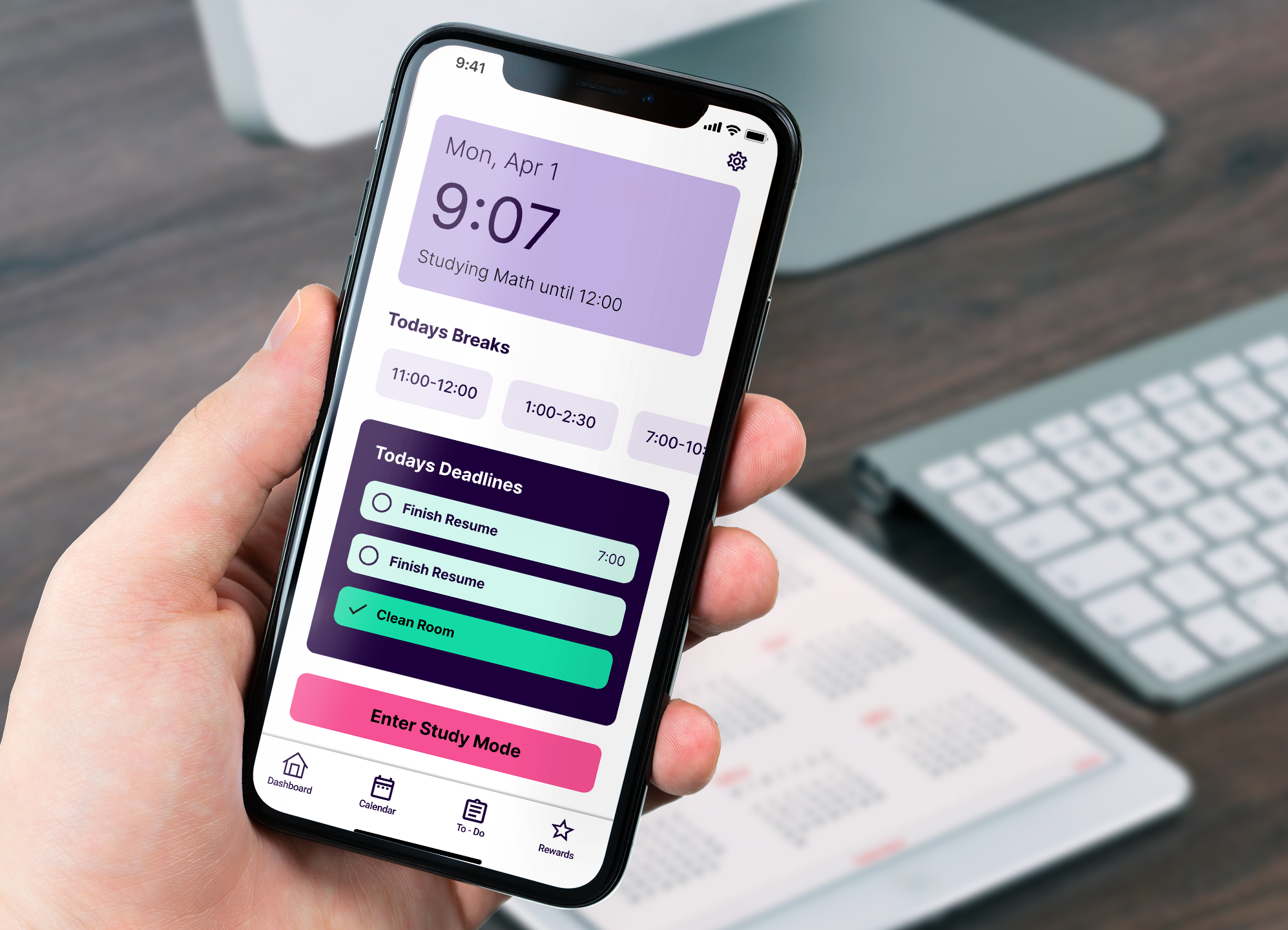
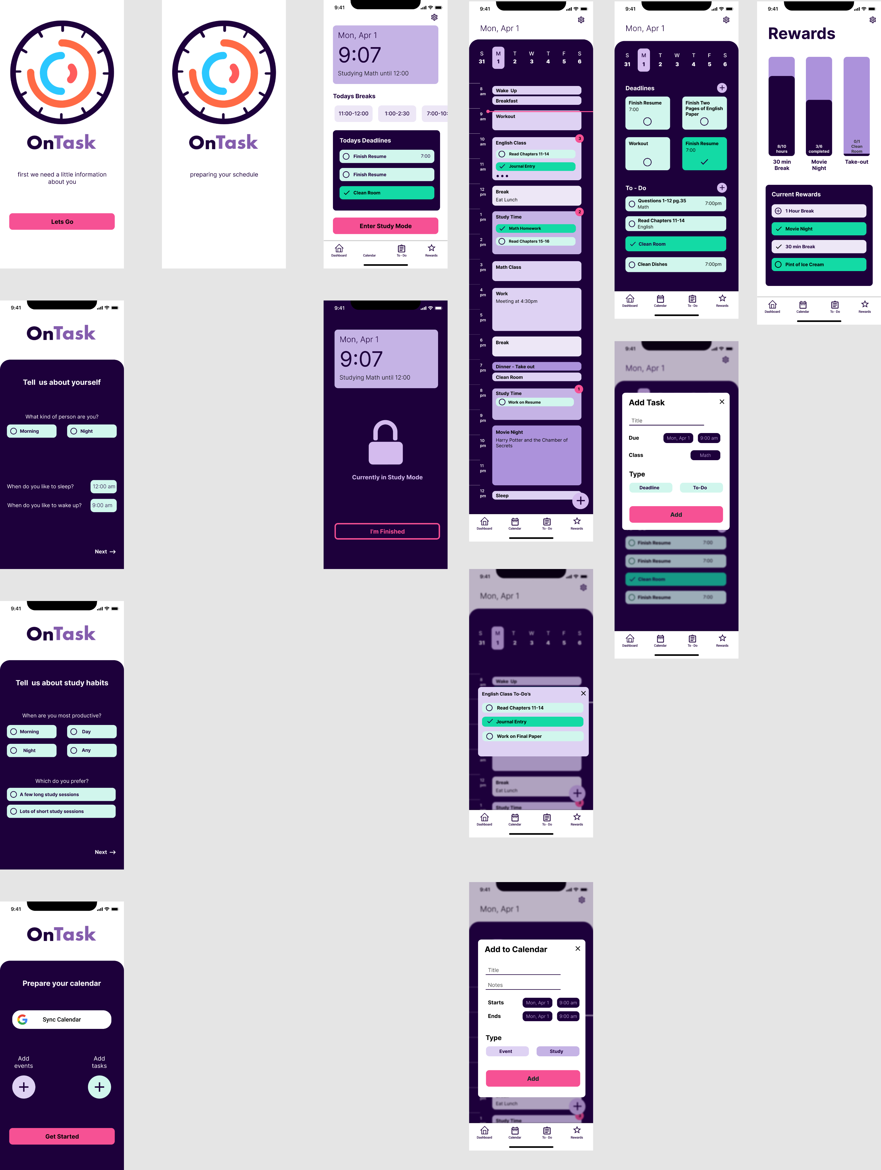
From my generative research, I determined that I needed to make an app that builds a schedule around the users' study habits and motivates them to complete their tasks. Therefore, my user flow consists of 5 main steps. First was onboarding, which is essential for my app. It allows the app to learn the users' study habits and build a schedule around it. After logging in, there are 4 paths a user can take. The first is the dashboard, which shows today's breaks and deadlines, and lets the user enter study mode. Second is a calendar for the day, with tasks and deadlines attached to specific events. Third is the to-do list, which lets users see and enter their to-do items and self-made deadlines. Lastly, the rewards page lets users see and use the awards they have gained, while also tracking their progress towards new ones.
Design Process
Ideation
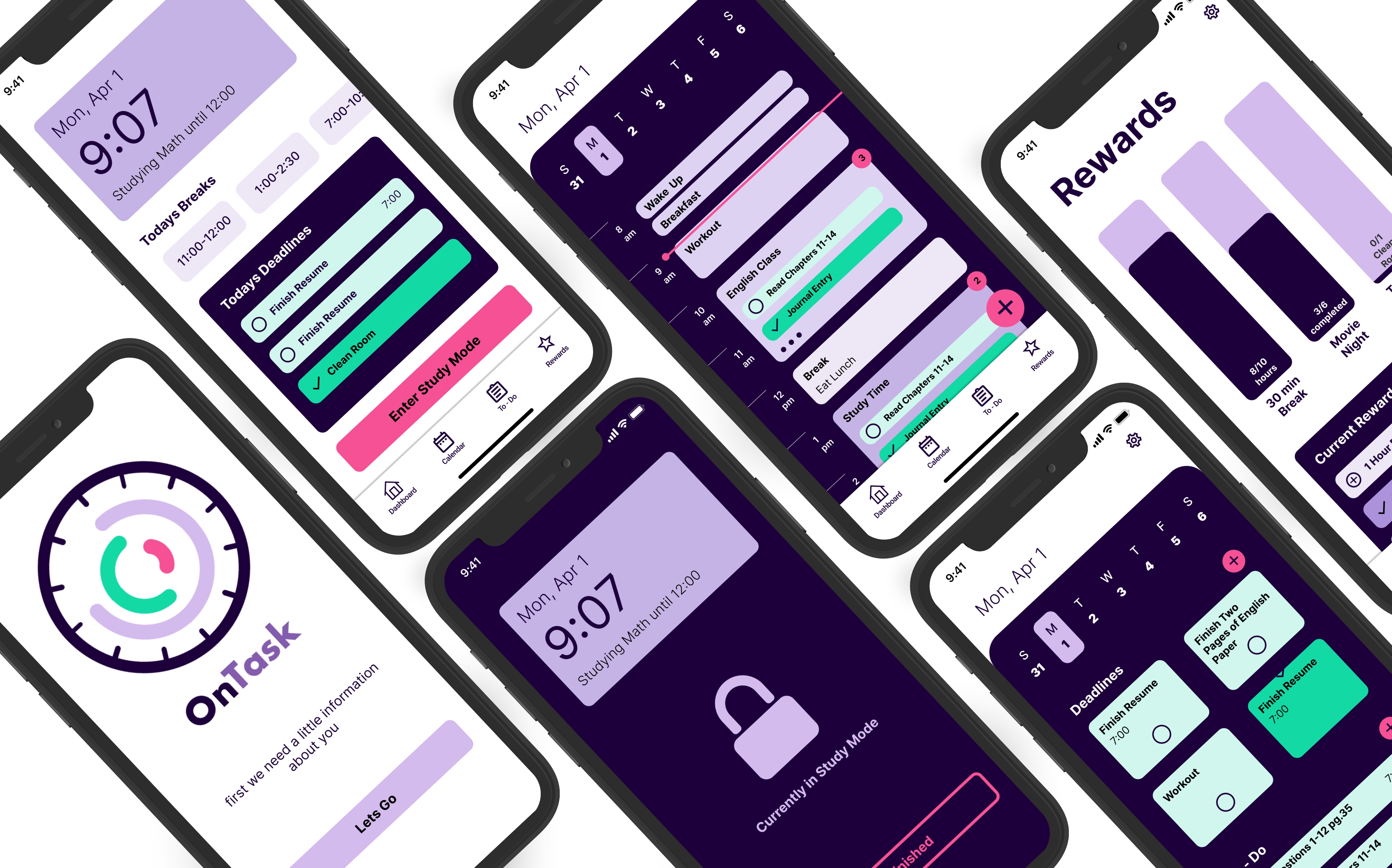
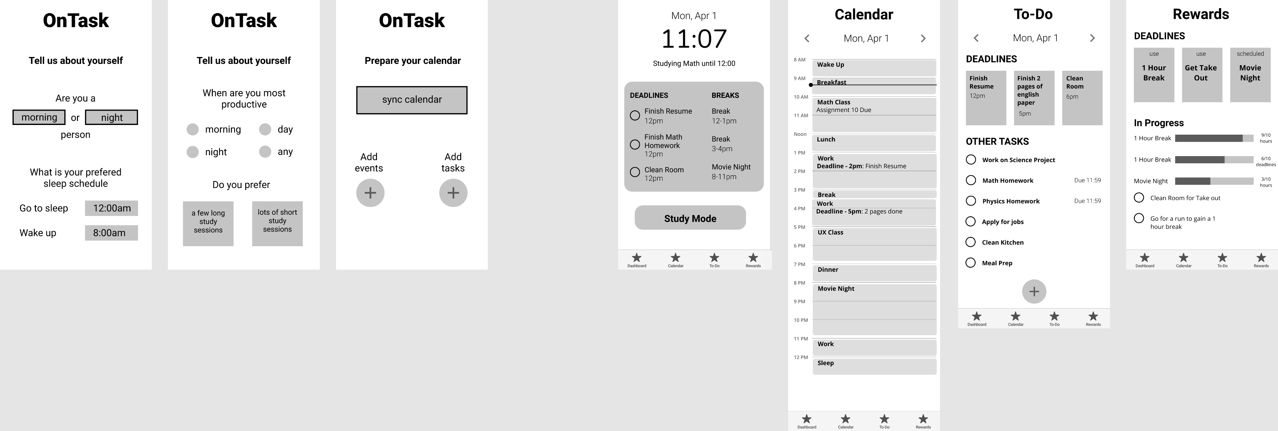
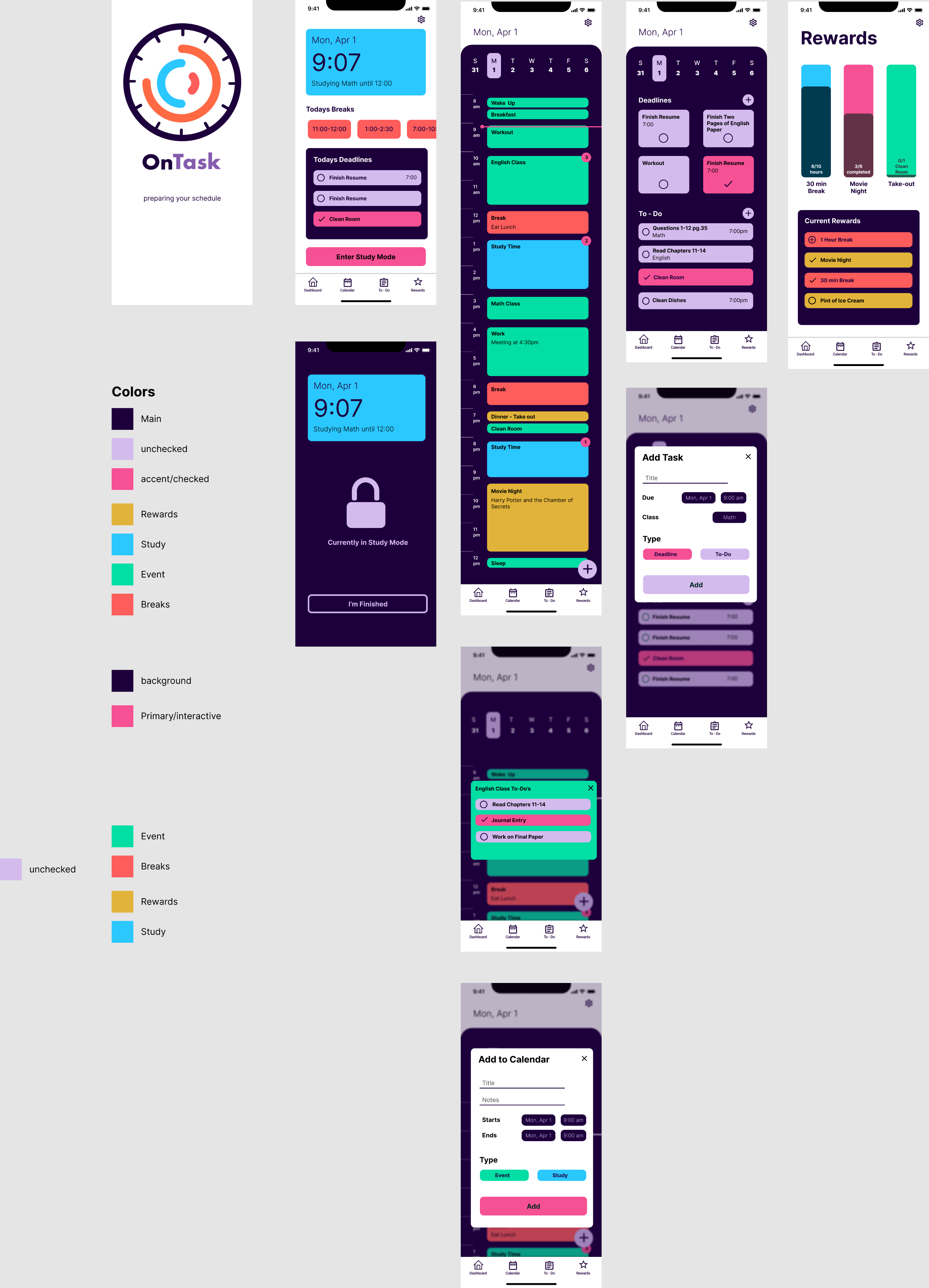
First, I took my information architecture and built a simple wireframe using those elements. Then, I went on dribble to get some inspiration for the design. I messed around with the layout until everything was condensed yet legible. Finally, I moved on to adding color, which would turn out to be the hardest part of my design. At first, my goal was to use color to distinguish between different types of events and tasks. However, after user testing, I found out that this only made it more confusing, and also didn’t pass accessibility standards. Therefore, I opted to use a difference in brightness and saturation instead.
Feedback
After user testing my prototype, there were a few key changes I had to make for my final design. First was the colors, which I mentioned earlier. There were too many colors so I simplified them down to three main colors based on interactivity. The fuchsia is the main interaction color and is also used for notifications. The green is used for all the task items and is more saturated for completed items. Lastly, purple is the main accent color, which does not have any interaction. However, I did use different shades to differentiate between the types of events such as breaks, study time, rewards, and normal events. Next, I added task items into the calendar cards, so they were easier to access. You can still click into events if there isn't enough room to show all its related tasks, and this is indicated by the three dots at the bottom. The last big change was adding the onboarding questions. With the prototype, some of my users didn't understand what the app was doing. Therefore, I had to explain that the app created the calendar around your study habits. However, now the onboarding process provides that information.
The Final Product
Key takeaways
The most important thing I learned was that everyone is different. Since the pandemic started, I have been having trouble being productive while working from home. Therefore, I wanted to design an app that solved this. Going into the generative research, I thought the users would tell me how much they hated working from home like I did. However, some of them showed me the positives, and they all had different study habits. This unique perspective helped me determine the real problems of working from home, and gave me good insights into how to solve them.
I also learned how to effectively use colors. Initially, I had a habit of using too many colors. I wanted to use colors as an informative trait instead of just using them for looks. However, it's hard to balance using many colors and keeping the design intuitive and accessible. In my final design, I learned how versatile one color can be when changing the saturation. Therefore, I plan on keeping color schemes simple in the future, but still grouping them by interactivity.
Additional testing
In the future, I would like to continue testing the onboarding process, and the rewards system. I want to make sure that the onboarding process is not only fast and simple but also lets the user understand what the app does without a real tutorial. As for the rewards systems, I would like to research and test different types of rewards, to figure out which ones are the most effective.
OnTask
Helped students stay productive while working from home by optimizing their schedule and motivating them with rewards.

Discovery
Interview insights
After interviewing six college students I was able to better understand the problems they had while working from home, the variety of study habits they used, and the unique things they did to stay on task. All my participants agreed that working from home was much more boring and monotonous. They also got distracted by their devices more frequently, which made it harder for them to stay focused on their tasks. Some of them had different study tricks for motivating themselves to complete a task. Also, they all agreed that being organized led to increased productivity. Therefore, I needed to design an app that organized student's schedules, eliminated distractions, and motivated them to do their work.
Building a user flow
I determined my initial user flow from my user interviews and the WAAD board I created from them. This helped me categorize my research into the main sections I need for the app. Then, I determined my initial golden path which consisted of creating a schedule around the user's study habits, keeping track of their to-do items, and a study mode to block notifications on the phone. Next, I made a list of extra features that could make the app better like adding rewards for completing tasks, or linking your schedule with your friends so you can study together. Lastly, I condensed the features down by importance and feasibility, which gave me the final user flow.


MVP
From my generative research, I determined that I needed to make an app that builds a schedule around the users' study habits and motivates them to complete their tasks. Therefore, my user flow consists of 5 main steps. First was onboarding, which is essential for my app. It allows the app to learn the users' study habits and build a schedule around it. After logging in, there are 4 paths a user can take. The first is the dashboard, which shows today's breaks and deadlines, and lets the user enter study mode. Second is a calendar for the day, with tasks and deadlines attached to specific events. Third is the to-do list, which lets users see and enter their to-do items and self-made deadlines. Lastly, the rewards page lets users see and use the awards they have gained, while also tracking their progress towards new ones.
Design Process
Ideation
First, I took my information architecture and built a simple wireframe using those elements. Then, I went on dribble to get some inspiration for the design. I messed around with the layout until everything was condensed yet legible. Finally, I moved on to adding color, which would turn out to be the hardest part of my design. At first, my goal was to use color to distinguish between different types of events and tasks. However, after user testing, I found out that this only made it more confusing, and also didn’t pass accessibility standards. Therefore, I opted to use a difference in brightness and saturation instead.


Feedback
After user testing my prototype, there were a few key changes I had to make for my final design. First was the colors, which I mentioned earlier. There were too many colors so I simplified them down to three main colors based on interactivity. The fuchsia is the main interaction color and is also used for notifications. The green is used for all the task items and is more saturated for completed items. Lastly, purple is the main accent color, which does not have any interaction. However, I did use different shades to differentiate between the types of events such as breaks, study time, rewards, and normal events. Next, I added task items into the calendar cards, so they were easier to access. You can still click into events if there isn't enough room to show all its related tasks, and this is indicated by the three dots at the bottom. The last big change was adding the onboarding questions. With the prototype, some of my users didn't understand what the app was doing. Therefore, I had to explain that the app created the calendar around your study habits. However, now the onboarding process provides that information.
The Final Product


Key takeaways
The most important thing I learned was that everyone is different. Since the pandemic started, I have been having trouble being productive while working from home. Therefore, I wanted to design an app that solved this. Going into the generative research, I thought the users would tell me how much they hated working from home like I did. However, some of them showed me the positives, and they all had different study habits. This unique perspective helped me determine the real problems of working from home, and gave me good insights into how to solve them.
I also learned how to effectively use colors. Initially, I had a habit of using too many colors. I wanted to use colors as an informative trait instead of just using them for looks. However, it's hard to balance using many colors and keeping the design intuitive and accessible. In my final design, I learned how versatile one color can be when changing the saturation. Therefore, I plan on keeping color schemes simple in the future, but still grouping them by interactivity.
Additional testing
In the future, I would like to continue testing the onboarding process, and the rewards system. I want to make sure that the onboarding process is not only fast and simple but also lets the user understand what the app does without a real tutorial. As for the rewards systems, I would like to research and test different types of rewards, to figure out which ones are the most effective.
OnTask
Helped students stay productive while working from home by optimizing their schedule and motivating them with rewards.

Discovery
Interview insights
After interviewing six college students I was able to better understand the problems they had while working from home, the variety of study habits they used, and the unique things they did to stay on task. All my participants agreed that working from home was much more boring and monotonous. They also got distracted by their devices more frequently, which made it harder for them to stay focused on their tasks. Some of them had different study tricks for motivating themselves to complete a task. Also, they all agreed that being organized led to increased productivity. Therefore, I needed to design an app that organized student's schedules, eliminated distractions, and motivated them to do their work.
Building a user flow
I determined my initial user flow from my user interviews and the WAAD board I created from them. This helped me categorize my research into the main sections I need for the app. Then, I determined my initial golden path which consisted of creating a schedule around the user's study habits, keeping track of their to-do items, and a study mode to block notifications on the phone. Next, I made a list of extra features that could make the app better like adding rewards for completing tasks, or linking your schedule with your friends so you can study together. Lastly, I condensed the features down by importance and feasibility, which gave me the final user flow.


MVP
From my generative research, I determined that I needed to make an app that builds a schedule around the users' study habits and motivates them to complete their tasks. Therefore, my user flow consists of 5 main steps. First was onboarding, which is essential for my app. It allows the app to learn the users' study habits and build a schedule around it. After logging in, there are 4 paths a user can take. The first is the dashboard, which shows today's breaks and deadlines, and lets the user enter study mode. Second is a calendar for the day, with tasks and deadlines attached to specific events. Third is the to-do list, which lets users see and enter their to-do items and self-made deadlines. Lastly, the rewards page lets users see and use the awards they have gained, while also tracking their progress towards new ones.
Design Process
Ideation
First, I took my information architecture and built a simple wireframe using those elements. Then, I went on dribble to get some inspiration for the design. I messed around with the layout until everything was condensed yet legible. Finally, I moved on to adding color, which would turn out to be the hardest part of my design. At first, my goal was to use color to distinguish between different types of events and tasks. However, after user testing, I found out that this only made it more confusing, and also didn’t pass accessibility standards. Therefore, I opted to use a difference in brightness and saturation instead.


Feedback
After user testing my prototype, there were a few key changes I had to make for my final design. First was the colors, which I mentioned earlier. There were too many colors so I simplified them down to three main colors based on interactivity. The fuchsia is the main interaction color and is also used for notifications. The green is used for all the task items and is more saturated for completed items. Lastly, purple is the main accent color, which does not have any interaction. However, I did use different shades to differentiate between the types of events such as breaks, study time, rewards, and normal events. Next, I added task items into the calendar cards, so they were easier to access. You can still click into events if there isn't enough room to show all its related tasks, and this is indicated by the three dots at the bottom. The last big change was adding the onboarding questions. With the prototype, some of my users didn't understand what the app was doing. Therefore, I had to explain that the app created the calendar around your study habits. However, now the onboarding process provides that information.
The Final Product


Key takeaways
The most important thing I learned was that everyone is different. Since the pandemic started, I have been having trouble being productive while working from home. Therefore, I wanted to design an app that solved this. Going into the generative research, I thought the users would tell me how much they hated working from home like I did. However, some of them showed me the positives, and they all had different study habits. This unique perspective helped me determine the real problems of working from home, and gave me good insights into how to solve them.
I also learned how to effectively use colors. Initially, I had a habit of using too many colors. I wanted to use colors as an informative trait instead of just using them for looks. However, it's hard to balance using many colors and keeping the design intuitive and accessible. In my final design, I learned how versatile one color can be when changing the saturation. Therefore, I plan on keeping color schemes simple in the future, but still grouping them by interactivity.
Additional testing
In the future, I would like to continue testing the onboarding process, and the rewards system. I want to make sure that the onboarding process is not only fast and simple but also lets the user understand what the app does without a real tutorial. As for the rewards systems, I would like to research and test different types of rewards, to figure out which ones are the most effective.
